Friday, 22 November 2013

Who are the New Elizabethans? My Opinion:

A New Elizabethan is someone who has had a great impact on society today and changed something in some way- much like Queen Elizabeth herself did.  Below I have listed 3 people who I strongly believe to be New Elizabethans because of the impact they have had on society. 

Vivienne Westwood


Vivienne Westwood is a New Elizabethan, because I believe she has had such a huge impact not only on British Fashion but British culture, over the past 30 years.
Starting out very small, as a primary school teacher in London, went on to designing jewellery to sell in Portobello Road in London. She then met Malcolm McLaren and they opened up their famous shop ‘Sex’ on the Kings Road in London. It is here that her career truly took off, as she designed and sold clothes that pushed the social boundaries of the time.  She was right at the forefront of the London Punk scene and sold clothes that were garish, sexually charged and extremely eccentric and completely designed to shock people. She is quoted saying "I was messianic about punk, seeing if one could put a spoke in the system in some way".
She is extremely bold with her views on everything from fashion to politics and has a refreshing no-nonsense attitude that is so similar to Queen Elizabeth I. Designer Jasper Conran was quoted saying “Vivienne’s effect on other designers has been slightly like a laxative. Vivienne does and others follow”. She has dominated the world of fashion, and is a well known political activist. This was well showcased in her 1989 cover of Tatler magazine, where she dressed up as Margaret Thatcher in a suit Margaret Thatcher was waiting for.  

Beyonce


Beyonce is without a doubt one of the most influential people of the past decade. The likeness between her and Queen Elizabeth I is remarkable. She is an absolute “modern day feminist”, and her songs and entire image are about female empowerment, monogamy, sexuality and love. Throughout her obviously public career, her love life has remained very private, until she married Jay Z, lending her the same wholesome, virtuous image of Queen Elizabeth. She has millions of followers around the world, from all ages who look to her for guidance on everything from fashion and style to living their lives in general.
Similar to Queen Elizabeth, Beyonce went through a transformation of her image. Starting off as a singer in Houston, Texas she went on to sing in Destiny’s Child, before taking off on her solo career to become the mega star she is today. She created her alter-ego “Sascha Fierce”, and this is the mask she presents when on stage. She has a huge amount of power in the world of pop culture, and has been dubbed as “Queen B”, a title she showcased in her Elizabethan inspired advert for her Mrs Carter World tour. The fact that the advert was such a huge success shows just how well the world responds to the idea of her as a new Elizabethan.

Anna Wintour


Anna Wintour is one of the most famous icons of fashion in the world. As the editor-in chief of American Vogue since 1988, she is one of the most influential figures in fashion history. The fact that she is best known for her over-sized sunglasses, bob hairstyle, and “chilly demeanour”, reminds me so much of Queen Elizabeth who had her trademark red hair, pale skin and untouchable image, yet related to so many people. She transformed Vogue magazine from a magazine aimed at wealthy, leisure loving women, to a magazine directed at the modern woman- fast paced,  independent executives who earned their own money and were not afraid to speak their opinions.  She has such an amazing understanding of what the industry needs, at the right time, and makes brilliant, fearless decisions constantly. She was the one who ended the ‘Supermodel era’, for example. She started favouring celebrities for the cover of her magazine over models. She was also the first to mix low-end fashion with high fashion in her magazine. It is this kind of thinking and decision making that makes me consider her a true Elizabethan. She is fearless, independent and knows what is right for her ‘people’, just like Queen Elizabeth did. What I love most about Anna Wintour being a new Elizabethan is that she influences everyone, even if they are not avid fashion followers. The following clip from the 2006 film ‘The Devil wears Prada’, which was based on Wintour herself best describes this.


Thursday, 21 November 2013

Technical Post: Elizabethan Makeup

To create our Elizabethan look we used:

-Illamasqua Rich Liquid Foundation in 100
-Illamsaqua Loose Powder in 010
-Illamasqua Velvet Blusher in Tremble
-Illamasqua Matt Primer

1. I started off by applying the base. I mixed the primer and the foundation on the back of the hand and buffed it into the skin, as it was easier to blend this way.
2. I then took some foundation on a mascara wand, and combed it through the eyebrows, so that they where whited out.
3. Once the foundation was even and well blended, I applied the powder, using a puff, pressing it onto the skin, as I wanted a really matte finish and an almost caked on look, for a more Elizabethan feel.
4. Next, using a blusher brush I applied the blusher, just to the apples of the cheeks. We really wanted to create the round, rosy blusher, rather than blended up to the temples like we see today.
5. Then, on a smaller brush I took the same blusher and applied it to the lips to add some colour.
6. I then took some foundation on a mascara wand, and coated the eyelashes.


This was a really good look to create as it gave me a good feel of just how different the Elizabethan makeup was from today's makeup looks. I found the foundation extremely difficult to blend, as it was very easy to see normal skin through if it was not even. This made me think that this was yet another reason they layered on so much of their foundation back in the Elizabethan times. I also blended my blusher a tiny bit too high up the cheekbones, and it is amazing how such a tiny technical application can make the difference between period and contemporary.

Wednesday, 20 November 2013

Lash Deco Workshop

In the Lash Deco workshop we had the exciting opportunity to play around with PAPERSELF Lashes.


PAPERSELF are the world's leading wearable paper-art brand for lashes. Based in London, their paper eyelashes, are a unique design, created using special paper and exquisite paper-cutting. The Lashes have been worn by celebrities and many creatives. A-listers such as Anne Hathaway and Rihanna have been snapped wearing PAPERSELF. Hollywood Blockbuster ‘The Hunger Game’s’, X factor, and renowned designer Manish Arora have also featured PAPERSELF lashes. The regular lashes can be worn in various ways to create different looks. You can either wear them in full to create a dramatic evening look or trim the full lash into smaller individual pieces to accessorize your eye and wear throughout the day.  You can literally customize your lashes to create your own signature look. 

We had the chance to recreate one of our face charts, incorporating the PAPERSELF lashes into the look. I chose to do my Analogous Colour face chart, and I applied the lash onto the eyebrow, as I thought it would be something different, and reminded me of the harsh, arched eyebrows we sometimes see in Elizabethan portraiture. Once the look was photographed however, I did not like the way the lash looked on the brow, as I think it gave the whole look an angry, masculine feel.


Lip Trip

To create the perfect lip, there are a few steps that need to be taken beforehand, because as with any makeup look, it is all about the preparation to ensure the best possible result.
Firstly, exfoliate the lips. You can use a muslin cloth to do this, as it provides really gentle exfoliation. A personal favourite of mine however is All About Lips from Clinique. 

Next, you need to hydrate the lips using a lip balm or emollient. Another favourite of mine is Burts Bees range of lip balms.

When doing any lip look, you must always consider the three C's. These are:
-The Curve of the lip 
-The Colour (Take into consideration the skin tone of your model and choose a colour that will best complement that)
-The Control that certain tools and products will give you, for example lip liners and brushes.

To create the perfect lip shape:
-Tilt your models head so it is at an angle facing you
-Start by drawing a line along the bottom lip, and holding your pencil at an angle start to draw up towards the corners of the mouth. Hold your pencil at an angle for more control and move in backwards and forwards motions until you get the perfect line.
- Start to draw the same on the top lip and finish at the cupids bow.


Adding a gloss to the centre of the lips will make the lips appear fuller.
To make any lipstick matte, hold a tissue over the lips, and using a small powder brush, pat transulcent powder over the lip.

Monday, 18 November 2013

My Chosen Design

I have chosen my third look for my final design, as I think it is the look that best showcases the Elizabethan influences, but still remains quite contemporary. I love the texture and I really want to achieve a glossy finish on the eyes and cheeks using shimmery pigments as I think it adds gorgeous texture but also a really contemporary feel. I would also like to add eyelashes to the bottom lashes to add a bit more drama to the eyes and to give it more of a contemporary feel.


Sunday, 17 November 2013

My 3 Final Face Chart Designs and Experimentation


This was the first design I created. It is a very pale face, with quite strong contouring. The eyes are left very neutral, and matte, with a cat eye style flick of black liner on the top lashline, for a more contemporary feel. I chose the dark berry lip, as I wanted a more modern twist on the red the Elizabethans wore. 

To create this look:
-I started off my priming my eyelids with MAC's Eye Paint in 'Bare Canvas.'
-Next I applied the eyeshadow 'Naked' from the Urban Decay Naked palette, all over my eyelid.
-I then took the colour 'Buck' from the same palette and blended it through my socket line to contour and define the eye.
-I then used my 'Extreme 24 hour felt tip liner' by Collection and drew on my eyeliner. 
-I finished off the eyes with 2 coats of black 'Mega Plush' mascara by Maybelline.
-For the base, I used Studio Fix Fluid from MAC in NC15- two shades lighter than my normal NC25. I wanted to see the look I would get using a paler foundation in my normal warm tones rather than the white Illamasqua foundation.
-I then powdered my skin with the HD Studio Finishing powder by NYX.
-For my eyebrows, I used the Brow Tech kit from Smashbox in 'Dark Brown' to define my brows.
-To contour my face, I used 'Omega' eyeshadow by MAC, on a small contour brush and I contoured my cheekbones, forehead and jawline.
-I then applied 'Tenderling' blusher by MAC, as it is a very soft rose colour and does not add too much colour, but helps to lift the skin a bit.
-To finish off, I applied the lipstick 'Vamp' by Sleek.


Although I liked the simplicity of this design, once it was applied, I felt it looked a little too contemporary, and I don't think you could tell it was inspired by the Elizabethans. Also, once I photographed the look, the foundation did not look as pale as it did in real life, although I'm not sure if that was to do with the lighting at the time.


The next design I created was slightly more dramatic. I kept the pale face and strong contouring as before, as I really liked those elements for my final look. I decided to go with different eyes however, using lighter gold colours on the eyes, a black liner all around the eye, finished off with some bold false eyelashes, inspired by a picture I'd seen on Instagram by one of my favourite makeup artists Asa Karlsten.
I wanted to keep the lips a dark berry colour to stick with my contemporary colour idea, but I wanted to apply the liptick in a heart shape for a very Elizabethan feel.  

To create this look:
-I primed my eyelids using MAC's Eye Paint in Bare Canvas.
-I then applied 'Woodwinked' by MAC, all over the eyelid
-Next I took 'Half-baked' from the Naked palette and blended it into the inner corner.
-I then used 'Charcoal Brown' by MAC, and blended it very softly through the socket line just to contour the eye a bit more.
-For the black eye line, I wanted to keep it quite soft, so I used 'Carbon' eyeshadow from MAC- a matte black colour- on a small angled brush and just drew it along my top and bottom lashline. 
- I added 2 coats of Mega Plush mascara to my lashes.
-I then applied my base. I used my NC15 Studio Fix Fluid again, as I did not have the Illamasqua foundation, and my NYX HD powder.
-I contoured my face again using the same 'Omega' eyeshadow. 
-Again, I wanted to keep my cheeks quite neutral, so I used 'Tenderling' blusher again.
-For the lips, I used the same 'Vamp' lipstick by Sleek, and using a round, domed shadow brush, I literally patted the lipstick on to create a more diffused 'sponged' look. I used my ring finger to blend the edges slightly, and then added more product to the centre. 
-I then applied the false lashes. These were a pair I happened to pick up in Poundland, and do not have a name. It was a pack of 2 pairs of lashes, so I applied a pair to the top and bottom lashes.


I really liked the finished look of this design. I though the eyelashed gave it a really nice modern feel with an almost doll like feel, and reminded me of a look I created a couple of years ago for a friends photoshoot, which was doll inspired, but looking back now, looks very Elizabethan as well!


This was my third and final design. I wanted to go a little bit more extreme on the eyes, but in a softer way. I decided to use bright, shimmery gold colours as I love the almost liquid metal texture it creates. The face was kept pale, and I used a bright red blusher on the cheeks and a bright orangey-red lipstick for a contemporary feel. 

To create this look:
-I started off by applying my base first, as I would need to blend the eyes out quite a lot. I used the Illamasqua Rich Liquid Foundation in 100, mixed with my MAC Studio Fix in NC25.
-I then powdered my face with my NYX HD powder, but avoided my cheeks, as I would be adding a cream blusher. 
-On a large, fluffy eyeshadow brush I toomy my 'Melon' pigment from MAC, and started blending the colour all over my lid using circular motions. I blended it right up to the brow bone, and on the inner corners of my eye towards the sides of my nose. I kept adding more pigment until I was happy with the intensity of the colour. I then took the colour underneath my eye and blended it right out towards the tops of my cheek bones.
-Next, I applied 'Libido' cream blusher by Illamasqua onto the apples of my cheeks and blended upwards.
-I then took more of the 'Melon' pigment on a large brush and used it as a highlighter over the top of my cheekbones and apples, to continue the liquid metal feel.
-For my lips, I chose 'Lady Danger' by Mac. This is a matte, orangey-red and I thought it would give the perfect contemporary twist to the dark red Elizabethan lip.


I really love this look, as I think it is very clearly Elizabethan, but the gold eyeshadow and bright lip really give it a more contemporary feel. I also love the texture of the gold shadow, and the way it makes the skin look really soft and dewy, contrasted with the bold, matte lip.
I think I'd like to choose this as my final design, but I may add some elements from the previous look, such as using the eyelashes with this look.

Saturday, 16 November 2013

Technical Post: Creating the Perfect Eye


Before starting any eye makeup look, decide what eye shape your model has, so that you can apply corrective eye makeup, to give the best final look.

Once you have done this, choose three colours that you think will compliment your model. Choose one light, one medium and one dark colour.
-Start by applying your base, as before, making sure to powder the eye extremely well, as you will be applying a powder shadow.
-Using a medium fluffy brush, apply quite a lot of loose powder underneath the eye. This is so that you can brush off any eyeshadow that may drop down whilst applying it, without disturbing the base under the eye too much.
-Apply the light colour first, using a rounded fluffy eye brush, all over the lid, right up to the eyebrow.
-Next, apply the medium colour on the outer corner of the eye and through the socket line to create a more defined look.
-With the dark colour on your brush, blend it into the very outer corner of the eye to intensify the colour, and furthur contour the eye.
-Using an angled brush, apply gel eyeliner. Start at the edge of the eye, as close to the lash line as possible and move your brush backwards and forwards to create the illusion of a fuller lashline. Take your brush and run it along the lower lashline to create definition.
-Next, using a brow brush/comb, brush through the eyebrows to remove any base left in them.
-To apply mascara, ALWAYS USE A DISPOSABLE WAND AND NEVER DOUBLE DIP. Get your model to look straight ahead and apply mascara down the lashes, across using wiggling motions, and then up the lashes. As a makeup artist you should replace your mascara's regularly and as soon as it starts to get cloggy, replace it.


Technical Post:The Perfect Lip

To create natural lips:

1. Make sure the lips are prepped, using a lip balm or some form of emollient.
2. Choose a colour that will enhance the natural colour of the lips.
3. Using a lip brush, or angled brush apply the lipstick, starting in the centre of the lower lip and working outwards, filling in the entire lip. 
4. Add a gloss if desired for a glossy effect, or blot down for a more matte, diffused look.


Friday, 15 November 2013

Colour Theory

Colour is the perceptual characteristic of light described by a colour name. Specifically, colour is light, and light is composed of many colours—those we see are the colours of the visual spectrum: red, orange, yellow, green, blue, and violet. Objects absorb certain wavelengths and reflect others back to the viewer. We perceive these reflected wavelengths as colour.

As a makeup artist, it extremely important to understand the basics of colour theory, so that you can understand which colours work well together and which ones don't. It can be the difference between an amazing, eye grabbing look and an average one that people will look past. Colours set moods and by making the most out of the moods that each colour creates, your opportunities to create characters and ideas are limitless. You will also need to know which colours work on different skin tones, which colours make certain eye colours pop, and which colours work in a completed look. 

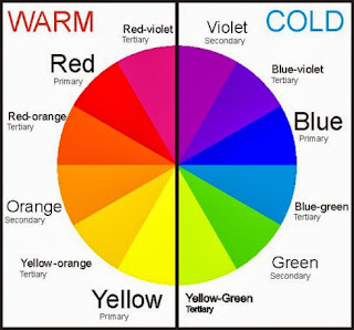
The colour wheel is an invaluable tool when it comes to understanding colour theory.
 It is divided into three categories: PrimarySecondary and Tertiary
-Primary: the three primary colours are: redyellow and blue. These colours are considered to be foundation colours because they are used to create all other colours.
-Secondary (or Intermediate): by combining two primary colours, three secondary colours are formed. For example, when you mix blue with red, you will get purple. The Secondary colours are: orangegreen and purple
-Tertiary: the six tertiary colours are made by combining a primary and an adjacent secondary colour. These colours are: yellow-orange, orange-redred-violet, violet-blue, blue-green, and green-yellow.

It is also important to understand the difference between warm and cool colours.


Warm colours tend to be bright, eye popping colours and can be aggressive. They tend to stand out much more. It is important to remember however, that in makeup artistry reds can be both cool and warm, depending on whether it is blue or orange based. This is easiest seen in red lipsticks. 


Ruby Woo by MAC- A blue based red

Lady Danger by MAC- An orange based red

Monochromatic Colour
Monochromatic colour schemes are made up of different tones, shades and tints within one hue. For example, a nude makeup palette (whether it be foundation, lipstick or eyeshadow) will be made up of a monochromatic colour scheme of different tones, shades and tints within a nude colour framework.

It is important to have monochromatic palettes in your kit, whether you make them yourself or buy them ready-made as this will enable you to tailor your makeup to each individual client or model. 

A face chart I created based on monochromatic, neutral colours.

Analogous Colour
Analogous (or Adjacent) Colors are created by using three (or more) colors that are next to each (side-by-side colors) on the color wheel.
You can find many analogous colors in eye shadow palettes. They are great for adding depth and highlights because you have different tones of the same general color family. You can add the darker color in the eyelid crease or along the lash line for depth and definition, and you can use the lighter colors for highlights.

A face chart I created based on Analogous colour.

Complimentary Colours
As mentioned before, the colour wheel will be your best friend as a makeup artist, not only for working out which eye shadow colours work best when blended together, but also for figuring out which colours will work best in relation to your client’s eye and skin colour. Someone with blue eyes, will be most complimented by using red-orange, orange or yellow-gold tones which can be seen when looking at the colour wheel. Complimentary colours are colours opposite each other on the colour wheel. 


Some highlighting and contouring work I did on Emma in the studio using complimentary colours, red and orange.

A face chart I created based on complimentary colours.

Neutral Colours
In colour theory, a neutral colour that is neither warm nor cool. Neutral colours are classy, sophisticated, and extremely wearable. They’re commonly worn on its own, or combined with brighter accent coloursthey can easily be matched with every colour. The meanings and impressions of neutral colours are much more affected by the colours that surround them than are warm and cool colours.
Black is the strongest of the neutral colours. On the positive side, it’s commonly associated with power, elegance, and formality. On the negative side, it can be associated with evil, death, and mystery.
White is at the opposite end of the spectrum from black, but like black, it can work well with just about any other colour. White is often associated with purity, cleanliness, and virtue. In the West, white is commonly worn by brides on their wedding day. White is associated with goodness, and angels are often depicted in white.
Brown is associated with the earth, wood, and stone. It’s a completely natural colour and a warm neutral. Brown can be associated with dependability and reliability, with steadfastness, and with earthiness. It can also be considered dull.
Beige is somewhat unique in the colour spectrum, as it can take on cool or warm tones depending on the colours surrounding it. It has the warmth of brown and the coolness of white, and, like brown, is sometimes seen as dull. It’s a conservative colour in most instances, and is usually reserved for backgrounds. It can also symbolize piety.
Ivory and Cream are sophisticated colorus, with some of the warmth of brown and a lot of the coolness of white. They’re generally quiet, and can often evoke a sense of history. Ivory is a calm color, with some of the pureness associated with white, though it’s a bit warmer.

A face chart I created based on a neutral palette.

One thing I will definitely take note of when creating my final look is the psychological reactions colours give.

Red: Passion, Love, Anger, Power, Sexy
Orange: Energy, Happiness, Vitality, Halloween
Yellow: Happiness, Hope, Bright, Summer
Green: New Beginnings, Abundance, Nature, Growing
Blue: Calm, Responsible, Sadness/Depression, Winter
Pink: Sweet, Lovely, First Love, Flowers
Purple: Creativity, Royalty, Wealth, Romance
Black: Mystery, Elegance, Evil
Gray: Moody, Conservative, Formality, Dull
White: Purity, Cleanliness, Virtue, Light, Snow
Brown: Nature, Wholesomeness, Dependability,
Autumn
Tan or Beige: Conservative, Piety, Dull
Cream or Ivory: Calm, Elegant, Purity

Tuesday, 12 November 2013

Inspirations for my Final Look

http://www.beagystyle.com/index.php#mi=2&pt=1&pi=10000&s=0&p=0&a=0&at=0

The above images from Harpers Bazaar Vietnam have really inspired me towards my final makeup look. I love the way the coppery gold eyeshadow is blended around the eye, as I think it is a lovely contemporary twist on the nude eyes they had in Elizabethan times. In the second picture particularly I love how the makeup is very soft, dewy, fresh and feminine against the harsh structured outfit. The outfit reminds me of armour and the texture appears very stiff, where the makeup all seems to flow, as it is beautifully blended.

I think I would like to use gold eyeshadow in my final look because I love the texture that is created from a shimmery gold shadow, and it would be a beautiful contrast against a paler face.


I came across the next two images on Instagram. They inspired me to create a strong brow for my look, as a strong brow is extremely contemporary, and is a contrast to the arched, over-plucked eyebrows that were so popular during the Elizabethan times.


This image is a perfect representaion of how I would like my skin to look in my final look. I have been really drawn to the pale skin of Elizabethan makeup throughout the project, and I love how the rest of the makeup contrasts against it so strongly. For my final look however, I would like to lighten my natural foundation, rather than go for a full white base, to achieve a pale look, as my natural skin tone is quite warm.


This is a look that I created about 2 years ago for a friends photoshoot. The idea that I had was actually a doll-inspired look, but now that I look at it again, it is a very contemporary Elizabethan look as well. One of my favourite parts of this look was the eyelashes on the bottom lashes. This is something I would like to incorporate into my final look, as I think it gives a really contemporary twist and it gives the eyes a really dramatic feel.