As a makeup artist, it extremely important to understand the basics of colour theory, so that you can understand which colours work well together and which ones don't. It can be the difference between an amazing, eye grabbing look and an average one that people will look past. Colours set moods and by making the most out of the moods that each colour creates, your opportunities to create characters and ideas are limitless. You will also need to know which colours work on different skin tones, which colours make certain eye colours pop, and which colours work in a completed look.
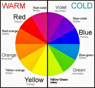
The colour wheel is an invaluable tool when it comes to understanding colour theory.
It is divided into three categories: Primary, Secondary and Tertiary.
-Primary: the three primary colours are: red, yellow and blue. These colours are considered to be foundation colours because they are used to create all other colours.
-Secondary (or Intermediate): by combining two primary colours, three secondary colours are formed. For example, when you mix blue with red, you will get purple. The Secondary colours are: orange, green and purple.
-Tertiary: the six tertiary colours are made by combining a primary and an adjacent secondary colour. These colours are: yellow-orange, orange-red, red-violet, violet-blue, blue-green, and green-yellow.
It is also important to understand the difference between warm and cool colours.
Warm colours tend to be bright, eye popping colours and can be aggressive. They tend to stand out much more. It is important to remember however, that in makeup artistry reds can be both cool and warm, depending on whether it is blue or orange based. This is easiest seen in red lipsticks.
Ruby Woo by MAC- A blue based red
Lady Danger by MAC- An orange based red
Monochromatic colour schemes are made up of different tones, shades and tints within one hue. For example, a nude makeup palette (whether it be foundation, lipstick or eyeshadow) will be made up of a monochromatic colour scheme of different tones, shades and tints within a nude colour framework.
It is important to have monochromatic palettes in your kit, whether you make them yourself or buy them ready-made as this will enable you to tailor your makeup to each individual client or model.
A face chart I created based on monochromatic, neutral colours.
Analogous Colour
Analogous (or
Adjacent) Colors are
created by using three (or more) colors that are next to each (side-by-side
colors) on the color wheel.
You can find many
analogous colors in eye shadow palettes. They are great for adding depth and
highlights because you have different tones of the same general color family.
You can add the darker color in the eyelid crease or along the lash line for
depth and definition, and you can use the lighter colors for highlights.
A face chart I created based on Analogous colour.
Complimentary Colours
As mentioned before, the
colour wheel will be your best friend as
a makeup artist, not only for working out which eye shadow colours work best when blended together,
but also for figuring out which colours will work best in relation to your
client’s eye
and skin colour. Someone with blue eyes, will be
most complimented by using red-orange, orange or yellow-gold tones which can be
seen when looking at the colour wheel. Complimentary colours are colours opposite each other on the colour wheel.
Some highlighting and contouring work I did on Emma in the studio using complimentary colours, red and orange.
A face chart I created based on complimentary colours.
Neutral Colours
In colour theory, a neutral colour
that is neither warm nor cool. Neutral colours are classy, sophisticated,
and extremely wearable. They’re commonly worn on its own, or combined with
brighter accent colours–they can
easily be matched with every colour. The meanings and impressions of neutral
colours are much more affected by the colours that surround them than are warm
and cool colours.
Black
is the strongest of the neutral colours. On the positive side, it’s commonly
associated with power, elegance, and formality. On the negative side, it can be
associated with evil, death, and mystery.
White
is at the opposite end of the spectrum from black, but like black, it can work
well with just about any other colour. White is often associated with purity,
cleanliness, and virtue. In the West, white is commonly worn by brides on their
wedding day. White is associated with goodness, and angels are often depicted
in white.
Brown
is associated with the earth, wood, and stone. It’s a completely natural colour
and a warm neutral. Brown can be associated with dependability and reliability,
with steadfastness, and with earthiness. It can also be considered dull.
Beige
is somewhat unique in the colour spectrum, as it can take on cool or warm tones
depending on the colours surrounding it. It has the warmth of brown and the
coolness of white, and, like brown, is sometimes seen as dull. It’s a
conservative colour in most instances, and is usually reserved for backgrounds.
It can also symbolize piety.
Ivory
and Cream are sophisticated colorus, with
some of the warmth of brown and a lot of the coolness of white. They’re
generally quiet, and can often evoke a sense of history. Ivory is a calm color,
with some of the pureness associated with white, though it’s a bit warmer.
A face chart I created based on a neutral palette.
One thing I will definitely take note of when creating my final look is the psychological reactions colours give.
Red:
Passion, Love, Anger, Power, Sexy
Orange:
Energy, Happiness, Vitality, Halloween
Yellow:
Happiness, Hope, Bright, Summer
Green:
New Beginnings, Abundance, Nature, Growing
Blue:
Calm, Responsible, Sadness/Depression, Winter
Pink:
Sweet, Lovely, First Love, Flowers
Purple:
Creativity, Royalty, Wealth, Romance
Black:
Mystery, Elegance, Evil
Gray:
Moody, Conservative, Formality, Dull
White:
Purity, Cleanliness, Virtue, Light, Snow
Brown:
Nature, Wholesomeness, Dependability,
Autumn
Tan
or Beige: Conservative, Piety, Dull
Cream
or Ivory: Calm, Elegant, Purity


.jpg)

.jpg)
.JPG)


.jpg)
.jpg)
No comments:
Post a Comment